Intro to Visualization:
How to make more effective research figures
Frank Elavsky, Data Visualization Specialist
Research Computing Services, Northwestern University IT
These slides:
https://nuitrcs.github.io/scientific-figures-workshop/
This repo:
github.com/nuitrcs/scientific-figures-workshop
Table of Contents:
1. A Test.
2. Myth or Law?
3. The Basics.
4. Gestalt Principles.
5. The "Problem" in Visualization.
6. A Systematic Approach.
Check your skills.
1. A Test.
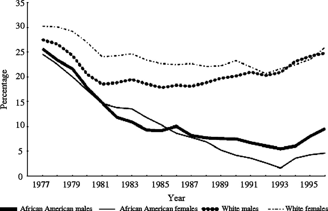
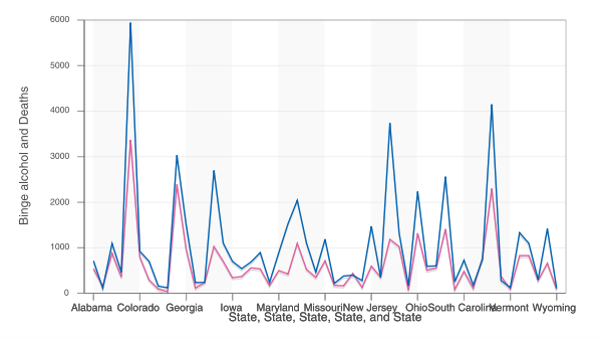
What does this figure show us?
Source: Lung Cancer Epidemiology
Is this a "good" scientific figure?
Why or why not?
Today's first lesson:
Don't rely on personal preference.
Think "effective" instead of "good" - this can be measured and observed.
2. Myth or Law?
Myth or Law:
Effective scientific figures should be beautiful.
Myth.
They need to communicate clearly. Beauty is secondary.
Keep in mind that viz for a scientific audience isn't the same as a public audience!
Great articles by Jen Christiansen of Scientific American:
Myth or Law:
Effective scientific figures should show everything in your research.
Myth.
You will lose your audience. Prime them instead.
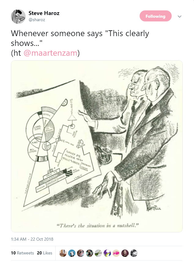
Source: Steve Haroz
Myth or Law:
Effective scientific figures should be simple.
Myth.
You can show complex information, but pick a single thesis at a time.
Source: Kellogg Insight
Myth or Law:
Effective scientific figures should always show geometric precision.
Myth.
You often have limited space and resolution. Do the best you can.

Source: Aaron Geller, FireFly
The truth is:
There are no laws.
There are only myths, guidelines, and principles.
3. The Basics.
So before you learn how to systematically measure effectiveness,
We must cover the basics.
Chart literacy is important.
Not just for the audience, but for communicators too.
Visualization is a
Chainsaw
Use wisely.
This is the chart version of a chainsaw massacre.
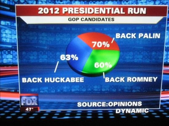
Think about your data! How did this happen?
An honest mistake... or?
Poor designer put their own name on this one.
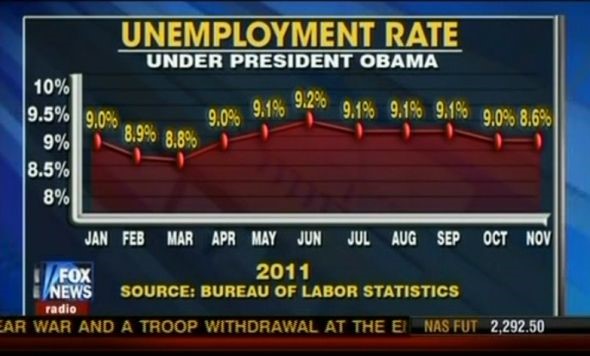
From Smashing Magazine's series: "Imagine a pie chart stomping on an infographic forever"
An "automated" visualization report.
Yikes.
4. Gestalt Principles.
Hacking the Mind
AKA: the “chainsaws of visual communication”
Proximity
(creates categories)
Similarity
(creates subcategories)
Contrast
(creates focus)
Commonality
(creates connections)
Continuity
(creates flow)
Closure
(creates suggestion)
Figure-Ground
(creates entry-point and layers)
Common Fate
(creates meta-categories)
Quick thanks to Pablo Stanley
@pablostanley5. The "Problem" in Visualization.
Any guesses?
Why do we show charts and graphs and figures?
Data is painful.
But you have the curse of knowledgeSo what do you do?
Hint: it's time to take notes!
6. A Systematic Approach.
Big Picture: Empathy and Awareness
Your skill in these will define whether your visualization is successful or not.
Audience, Purpose, Context
The holy triumvirate: Who, why, and where
Audience
Who is your visualization for?
This is the first and most important consideration.
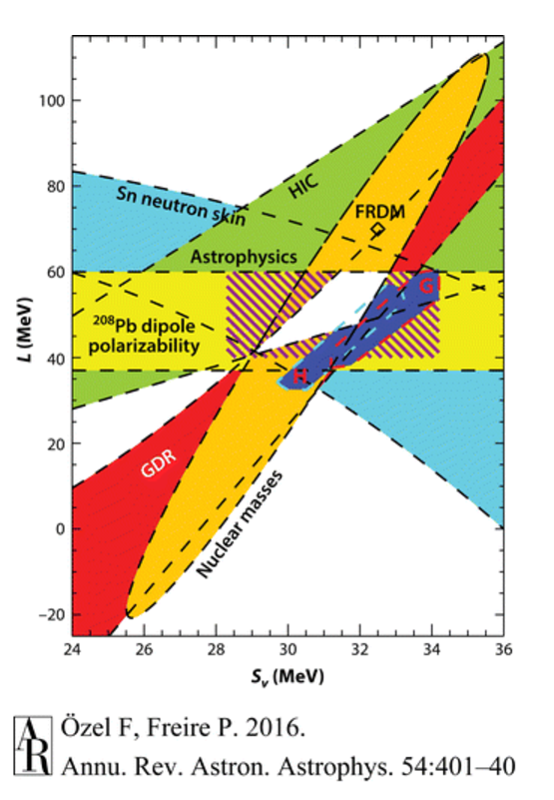
I'm not sure even astrophysists know what this means.
Disciplines intersecting over Equation of State. Ozel F, Freire P. 2016. Annu. Rev. Astron. Astrophys. 54:401-40
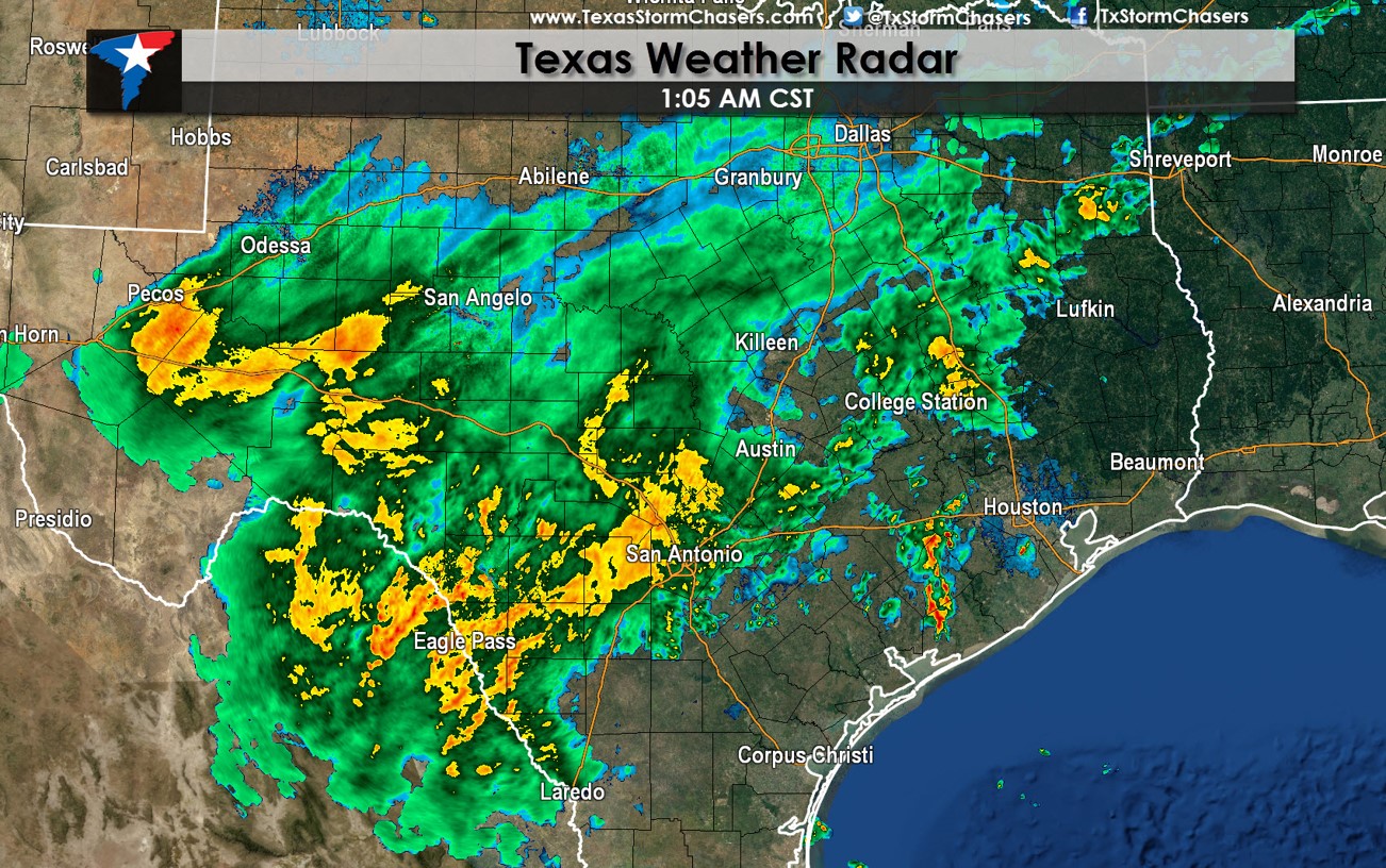
This color scale is very bad, but if meteorologists did things differently, the public would lose their minds.
Texas Storm Chasers
Purpose
Why are you visualizing data?
How can you measure your success if you don't define your purpose?
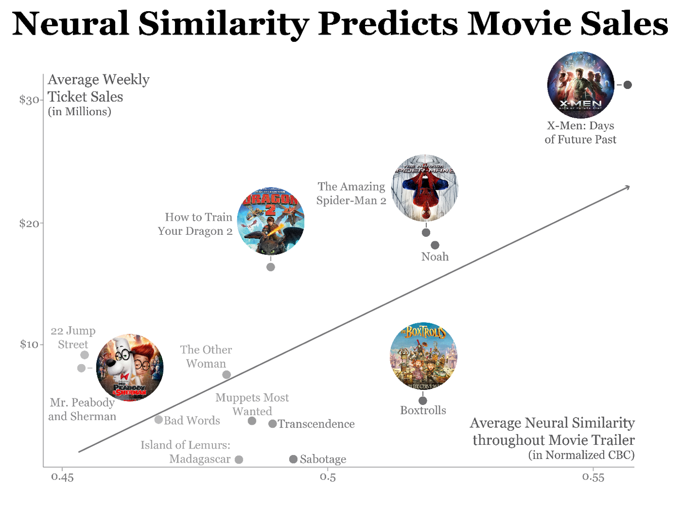
This is explaining data to a general audience - a little fluff is acceptable to keep their interest.
Brain response predicts movie sales.
This is learning data for your own analysis - not meant to be pretty.
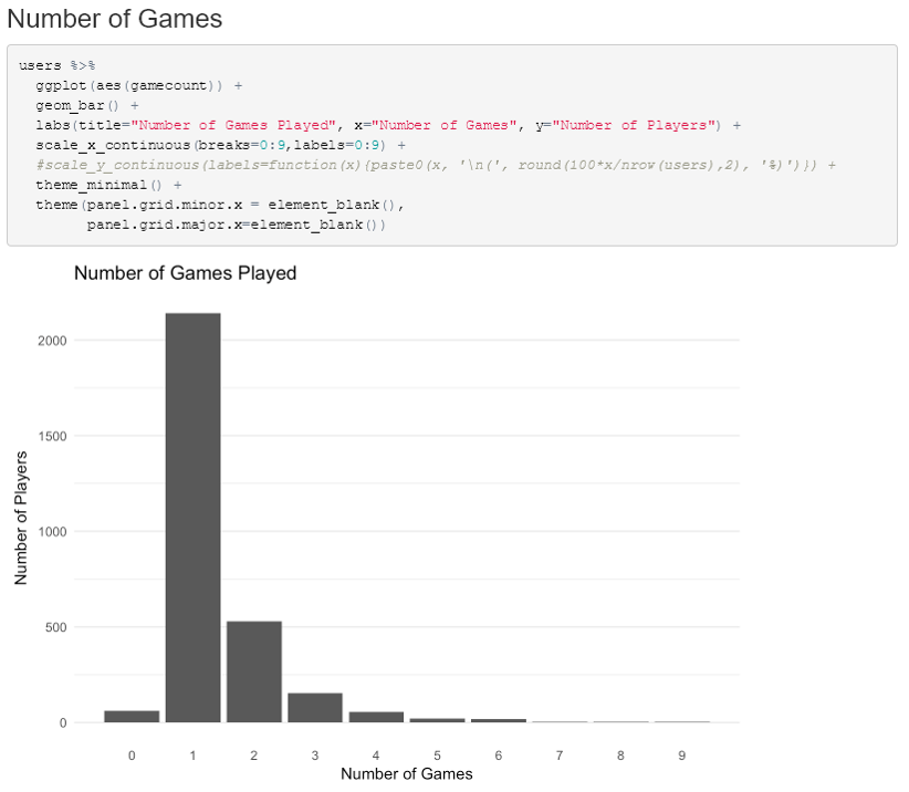
Using ggplot to test data
This is exploring the dimensions of the data - meant for the audience to learn something (not you)
"How will Automation Affect Different US Cities?"
Context
Where does the visual end up?
You can do a lot differently depending on the answer to this question.
Editors: "Print. Small size. No color." (Given the context, this isn't too shabby!)
Lung Cancer Epidemiology
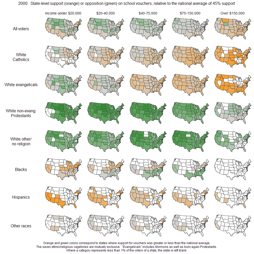
Small multiples are great for many static dimensions (if you have the room)
"Public support for vouchers"
Time+scope are part of context too!
How long do you have and how much do you do?
Don't wait until the end of your research or analysis before you consider this.
7. Check your skills.
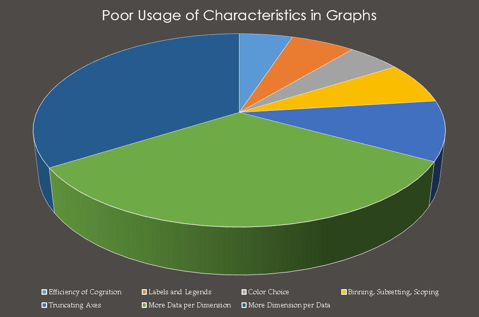
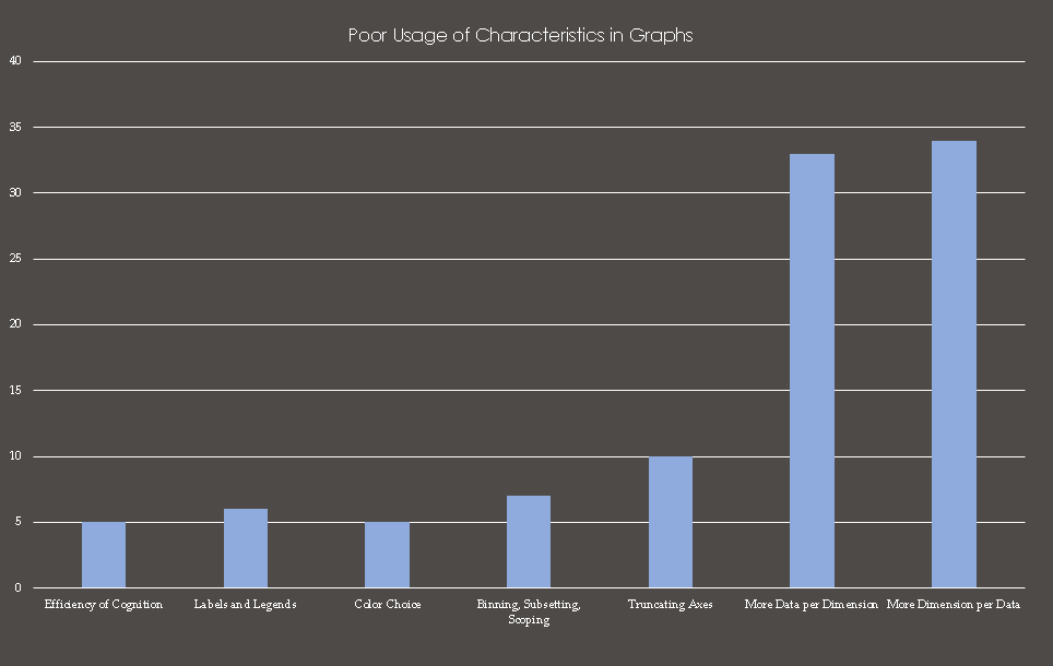
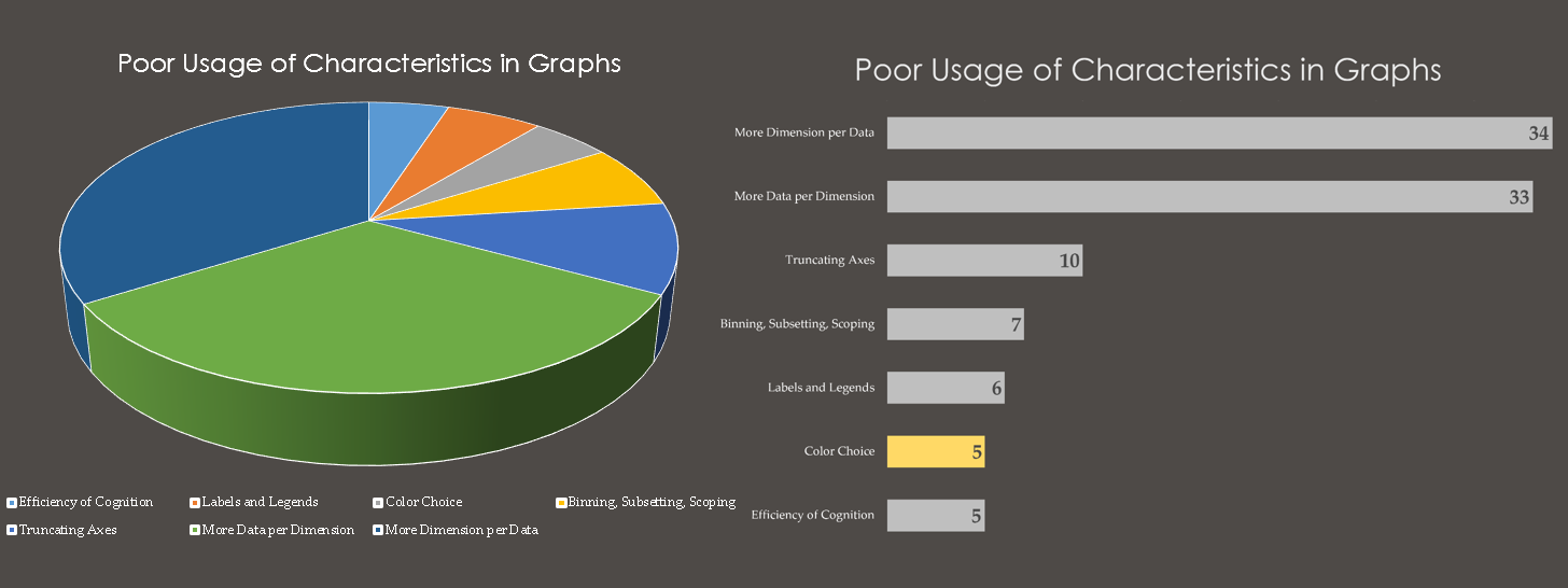
This is a monster.
Tell me why. What is wrong with this?
Which wedge is largest? Smallest?
This is a case of too much dimension for the data.
Default bar version from excel
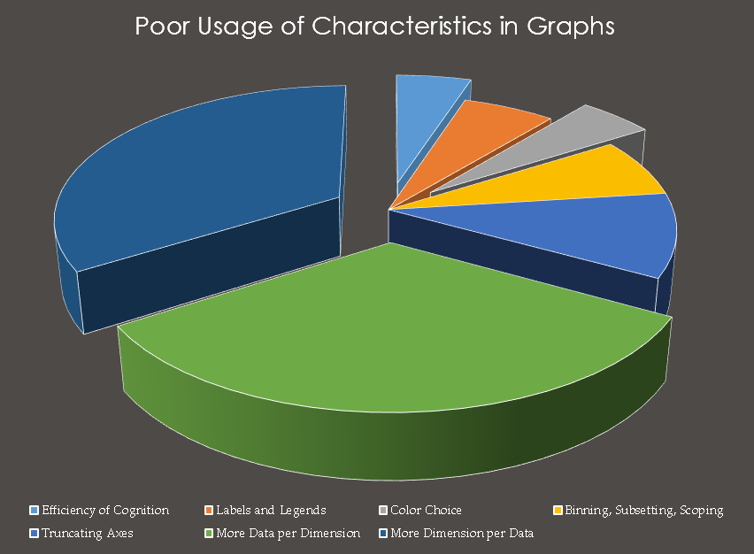
What can we improve about this? Use empathy. What is hard?
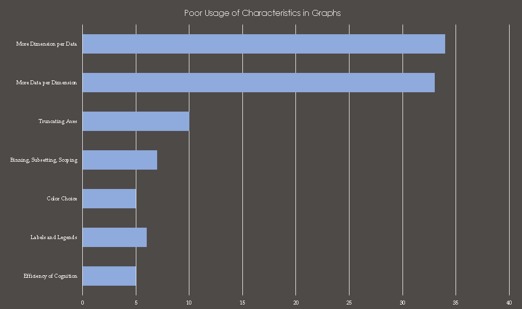
Horizontal has more room for text
Text is often a big limitation for the context of your visual.
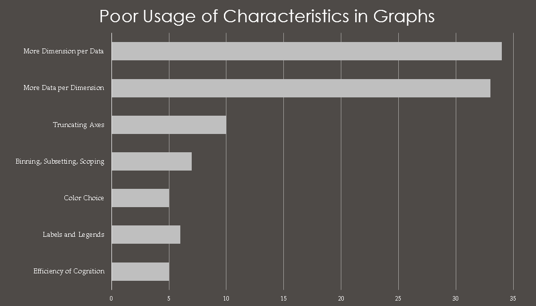
Cut axis, bump up font size
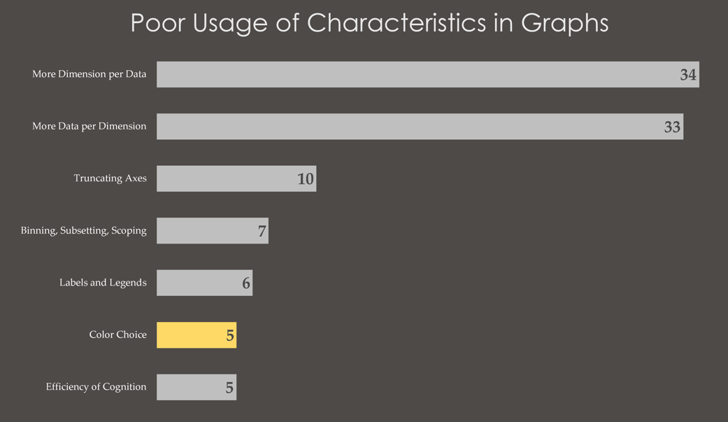
Sort and use color to emphasize
Much better.
Minimize the time your audience takes to understand your purpose.
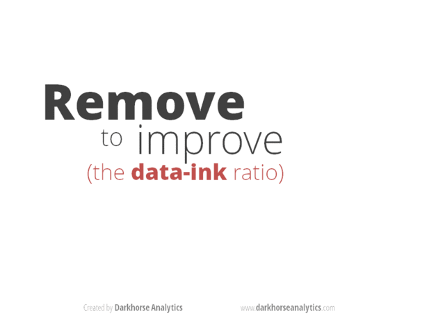
Edward Tufte's 'Data to Ink Ratio'.
The golden rule of visualization.
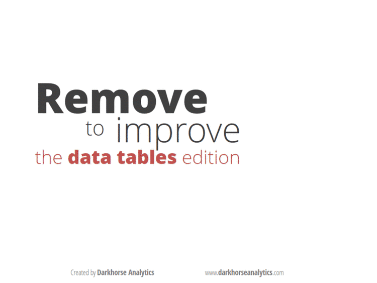
Even your tables have 'ink'
These gifs courtesy of Dark Horse Analytics
BONUS: Now you have a task!
Audience: Everyone here
Purpose: Compare two groups of congress members
Context: 25 minutes, using Excel
Go to github for the file 'datasets/congress_data.csv' and get to work.
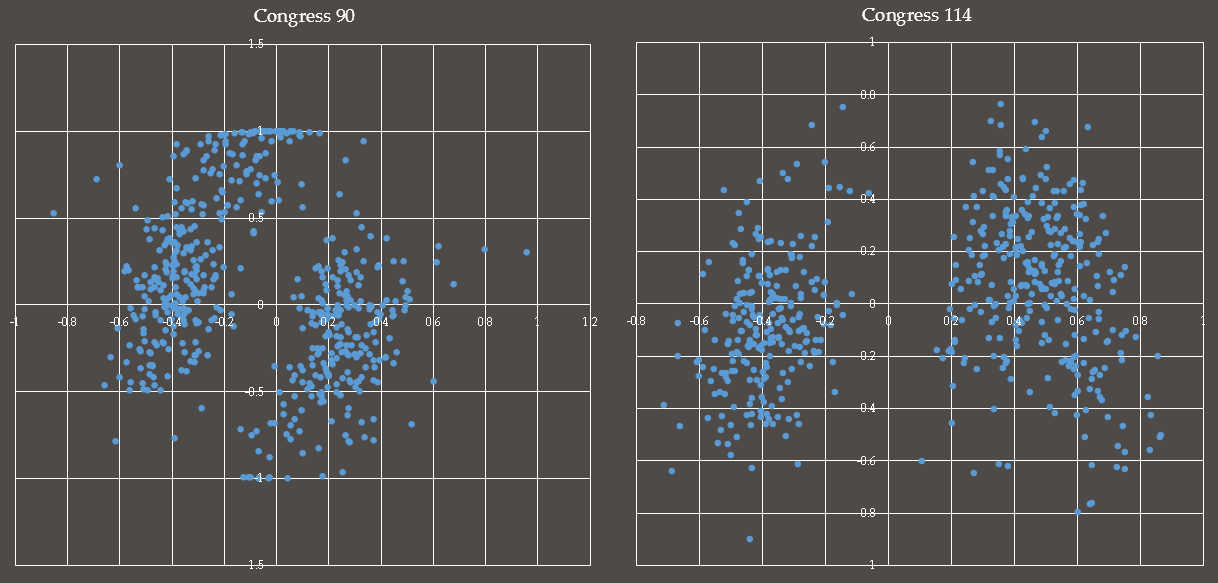
This was my 5 minute attempt
I want you to do better with just 20 minutes more.
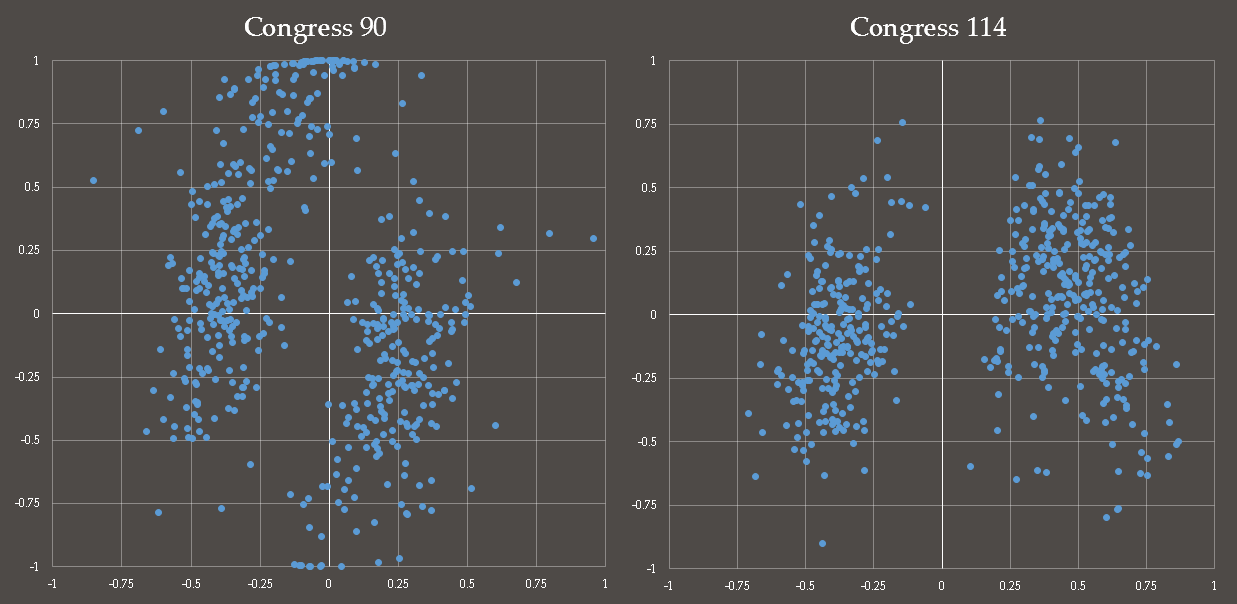
My slightly improved version.
Whew, what a rush.
You have all leveled up as Chart Wizards. Congrats.
Your take-aways:
Empathy is the key to effective visualization
Audience
Who is your reader? What about your data will be difficult for them?
Purpose
Why are you visualizing your data? How will you know when you have succeeded?
Context
Where/what/when are your limitations? Do you have the scope to do what you want?
Frank Elavsky, Research Computing Services, Northwestern IT